Your book will be first seen by potential book buyers in thumbnail size view
It is sometimes said that people need to see something seven or eight times before they will react.
When it comes to book covers, it is a truism that is probably very true.
You might think that your cover image is fantastic, and in full-size view, it may well be.
However, to get to your book page on book retailer sites, readers searching for a new book to buy will first have to notice, and click, your thumbnail size cover.
So, how does your tiny book cover image stack up for attracting attention?
Thumbnail images are used on every book related site you possibly think of, so it is vital that you consider image size when you are making decisions about a new book cover.
Even the featured image of your book cover on your sales pages of Amazon, iBooks, Barnes & Noble and others retailers, are reduced default thumbnails.
The best way to start analysing how well your book cover works is to open your cover file in an image editor and reduce the size.
Thumbnails can be very small, but if you start with setting your dimensions to 90 pixels wide x 144 pixels tall, and then view actual size, you will see your cover in an approximation of an online thumbnail.
It is also important to remember that on top of reducing the dimensions, all sites reduce the image quality or resolution to at most, 72 dpi.
If you can also change the resolution in your image editor, it will give you a better estimation of how good, or not so good, it will look online.
Understanding thumbnail dimensions
Quoting Amazon’s recommendations, the ideal size of eBook cover art is a height/width ratio of 1.6:1. This means that for every 1,000 pixels in width, the image should be 1,600 pixels in height.
However, the full size of your image upload will never be seen. Your original file will be reduced to a range of additional image sizes to suit different reading devices, on-screen applications and different website uses.
Amazon automatically generates a lot of different custom thumbnail sizes on its site.
Here are a few examples to help you understand the necessity of covers that work in small dimensions.
On the Top Charts page, covers are quite small to give the chart number significance.

New releases are shown in the most common view size, which is 107px x 160 px.

Recommendations are a little smaller at 90 px x 135 px.

Series books are usually a maximum of 135 px high.

In the You Viewed pane at the bottom of each book page, books that were viewed by people are squeezed into a 50 px x 50 px box.
That is insanely small.

What about on your blog or website?
Your website most probably uses thumbnails as links to your book pages, or in your site search. You need to make sure they are dimensionally correct.
There are settings for your post thumbnail and standard image sizes on most blogging platforms.
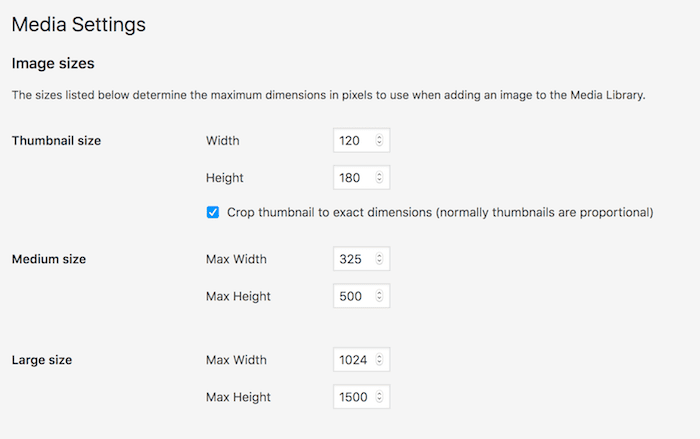
On WordPress, you need to go to Settings>Media to adjust your sizes. The default image thumbnail size is 150 x 150.
This is not at all practical if you are promoting your books on your site as it will crop or squeeze your cover image.
You should change the settings for all three sizes to match a ratio of 1.6:1 as in the image below. Importantly, check the box to crop to exact dimensions.

Judging your book cover, honestly
The best way to evaluate your cover in reduced sizes is to check it against some other books in your genre.
Chances are that many of the most popular will have covers that stand out when viewed in smaller sizes.
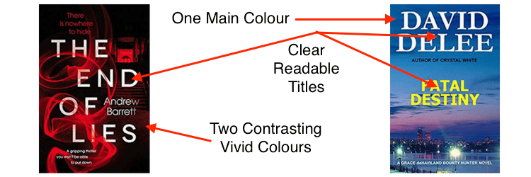
The main qualities to look for are the clarity or readability of the book title and the visual appeal of the principal colour or colours.
I chose the two covers below at random from Amazon. You can do the same for your testing. All you need to do is go to a book on Amazon, right click on the cover, and you can download the image.
You can see that they both have outstanding qualities for a thumbnail book image.

It can be as simple as remembering that white titles on a dark background or dark titles on a light background are going to work best because of the natural contrast.
Also, sans-serif fonts are much easy to read when viewed in a small image.
In the end, the best covers use simplicity. Covers that are busy with a lot of text and graphics often become a thumbnail blur.
Another huge factor is the quality of your original image.
If you uploaded a low-resolution cover image, sites will automatically apply lossless or lossy compression to reduce your image.
Even if your image size was the maximum possible, but at 72 dpi, low resolution when compressed results in even lower resolution.
It is far better to upload a high-resolution image of 300 dpi, which will keep most of its clarity when compressed.
Summary
Your thumbnail book cover is what is going to attract readers to consider buying your book.
Therefore, you should take great care when choosing your cover design. It might look absolutely fantastic in full-size viewing.
But until you reduce it to a size the real world is going to see, you can’t make an objective decision.
Always reduce your potential cover designs to small sizes and low resolutions that will be used online as part of your evaluation.
Your book cover needs to shine to get noticed, so make sure it is highly noticeable and that it really stands out from the crowd.
You Might Also Like These Articles
Previous answers to this question
This is a preview of an assignment submitted on our website by a student. If you need help with this question or any assignment help, click on the order button below and get started. We guarantee authentic, quality, 100% plagiarism free work or your money back.
 Get The Answer